1. motion, 2. colour, 3. fluid thoughts
Through the three different workshops, I learnt mostly how I can express my idea through the each different methods of visual presentation.
For the motion, what I learnt was that how I can deal with unsual program to me like "window movie maker". Although taking photos by myself was a bit tough because I didn't want to show my body at all in the pictures- so had to use fishing string and stuff, I had a lot of fun with playing around a lot of stuff on the pictures. such as overlapping original pictures with different materials or drawing onto the pages.
For the colour, this workshop was the hardest among the 3 workshops I did. First time i thought colour would be the most interesting to me but I realised that the works we had to do is not my type of things since we had to use computer a lot- scan everything and use photoshop which I do not really enjoy. But I still learnt how colours go together and composition of books.
For the fluid thoughts, This workshop is the best since I enjoyed much more than the others. charcoal drawing was not really familiar to me for the first time but after all the a4 sketches, now i feel more confidant with perspective charcoal drawings.
Monday, 20 October 2008
Sunday, 19 October 2008
fluid thought - charcoal drawings.
Monday, 22 September 2008
Some of the Contents of atlas

building from steven holl - this is a kind of perspective drawing (looking up the view of the sky from the ground level)

Face map (steven holl) -basically I used tracing paper to trace the architect's face and the major colours i chose to represent the colour of nature such as the colour of water, grass, moutain, and sky.
Research + Reflection
William Kentride
He is a South African Artist best known for his animated films filming a drawing, making erasures and changes, and then filming it again. He started studying mime in the beginning of 1980s in Paris. He had wanted to be an actor, but he found that he was not talented enough to be an actor. His animations normally deal with political or social issues from his point of view.
These lists are all his films:
Johannesburg:2nd Greatest City After Paris, 1989
Monument, 1990
Mine, 1991
Sobriety, Obesity & growing old, 1991
Felix in Exile, 1994
History of the Main Complaint, 1996
Weighing and Wanting, 1998
Stereoscope, 1999
Medicine Chest, 2001
Automatic Writing, 2003 - As I have watched some
of his films and trailers, the most striking film is
Automatic Writing. This film shows dynamic
movement with moving objects such as fish in the
fishbowl and the each of the letters.
Footnotes :
1. Kentridge, William, William Kentridge : telegrams from the nose : films, sculpture, drawings, tapestry, etchings.,
(Sydney, N.S.W. : Annandale Galleries, 2008), 6-20
3. Wikipedia , http://en.wikipedia.org/wiki/William_Kentridge. (accessed : 17. 08. 08)
Reflections
The title of the film is “Happy GO!” which means each of the different emotional eggs are all ended up with smiling, but they express all different emotions while they are doing each activities(washing dishes, taking supplementary pills, eating) in the kitchen. The descriptive statement is that “Whether I like or not, I have to do” which means the emotional eggs represent me with each different emotion for the activities. The one of the photos(has this mark?...! on) might be questioned as it is noticeably abstract. I tried to express that the feelings for the pills for myself which are always questionable whether it works on me or not but I could have found out that it actually keeps my body in a good condition.
I had difficulties with taking photos because I had to take photos all by myself. Thus, I had to boil the eggs which are usually easy to be broken and needed to use fishing lines which is not as visible as normal strings. The play-doh, tissue and a real dishcloth were used to do modeling and tracing paper was used to do drawing (since the cost of colour photo printing is expensive). In addition, some materials such as rice paper (washing dishes-bubble), cotton string on the top of the play doh(the word “well-being”) and colour transparency film have been used to do crafting. The pictures with colour transparency film on are saying that the red is unhealthy mode, the yellow is careful mode, and the green is healthy mode. I have found that the quality of the pictures changed after re-picturing the original printed pictures.
Moreover, the shadows can be seen in the re-pictured photos especially at night.
Friday, 20 June 2008
Wednesday, 18 June 2008
EXP3-Google Warehouse.
1.ELEVATOR1 : DM-ARCH1101_EXP3_SOO HEE_HONG
2.ELEVATOR2: DM-ARCH1101_EXP3_SOO HEE_HONG2
2.ELEVATOR2: DM-ARCH1101_EXP3_SOO HEE_HONG2
Exp3-Final UT2004 3 images
Exp3- Final Elevators

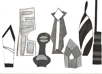
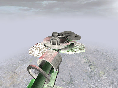
for Versace- this elevator gives an access to the dining area where the two clients meet for lunch. The outlook of the elevator is very complicated because most designers think much sometimes too much. And the fashion style from Versace is really fancy looking, so i want it to get all the eyes concentrated on it.
Thursday, 29 May 2008
Friday, 23 May 2008
Subscribe to:
Comments (Atom)


.jpg)


